There is a dangerous sentence in game development:
“I’ll just build the website.”
That was more or less where this started.
TRACEWAKE already had a domain. Aurelius and Ghostline had both grown into proper identities. VIGIL and BLACKWIRE were becoming persistent places rather than labels stuck on top of a Red Team / Blue Team prototype, and the Wolf Interactive site already had a development journal following the project.
So the obvious next step was to give TRACEWAKE its own home.
Simple enough.
That lasted about five minutes.
A website about TRACEWAKE was not enough
The first versions looked fine. Dark background. TRACEWAKE branding. Some information about Aurelius and Ghostline. Screenshots. Development status. The normal things you expect from a game website.
And that was exactly the problem.
It looked like a website about TRACEWAKE.
It did not feel like TRACEWAKE.
One of the early transition screens is a pretty good example. The idea was sound: Aurelius on one side, Ghostline on the other, same incident, different perspective. The execution was basically a giant blue A and red G staring at each other across a line.
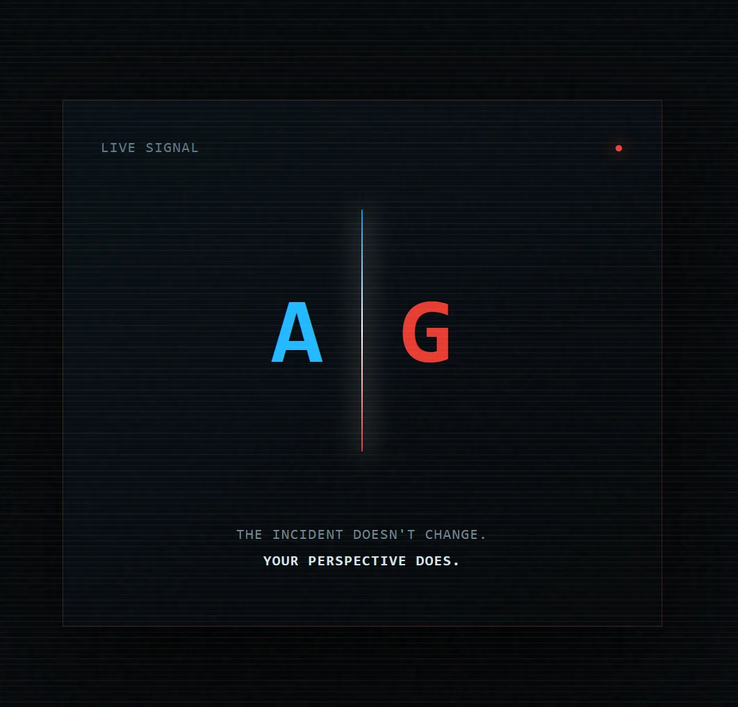
It was technically mysterious.
It was also the sort of mysterious where you look at it and ask, “What is this meant to be?”
Useful feedback.
That became the rule for the rest of the build: the website should not explain that it feels like the game. It should simply feel like the game.
Start with the systems that already exist
By this point, TRACEWAKE already had a much stronger visual language to work from.
Aurelius is structured, corporate and accountable. VIGIL is clean, cool and organised around operations, mail, intelligence and response. Ghostline is different by design. BLACKWIRE is denser, transactional and less comfortable, built around contracts, exposure, traces, credits and information that may or may not be safe to keep.
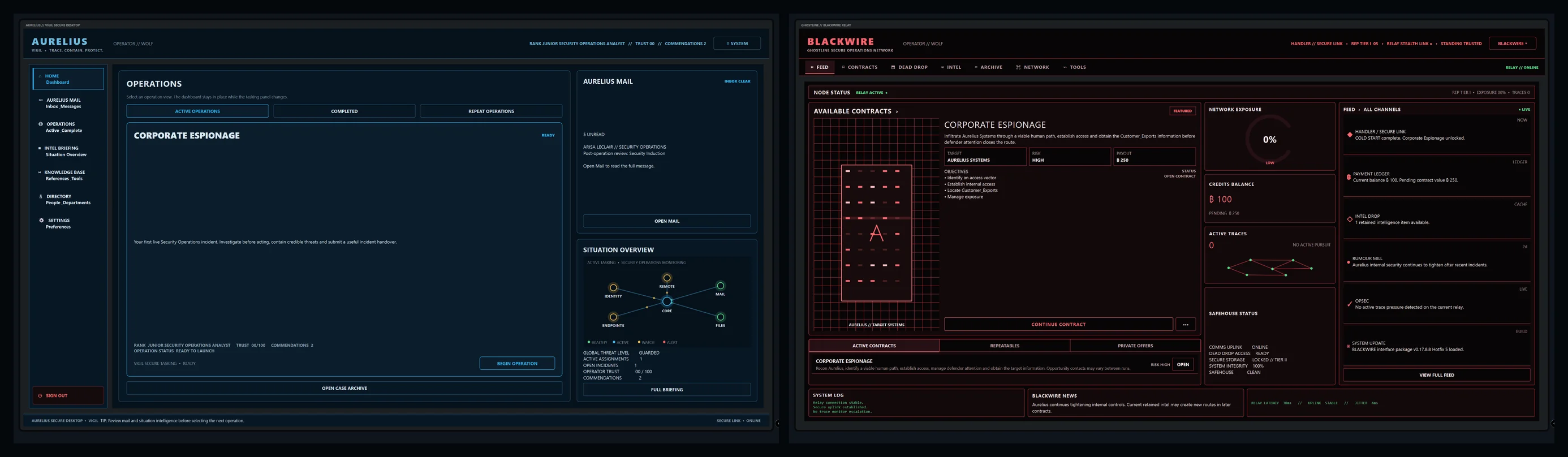
That gave the website a much better reference point.
The neutral TRACEWAKE view keeps both sides visible. Choose Aurelius and the site shifts toward the solid blue visual language of VIGIL. Choose Ghostline and the presentation moves toward BLACKWIRE’s dark red and muted mauve panels.
Not just a coloured border. Different interface weight, different panel treatment and a different feeling about what kind of system you are connected to.
The boot sequence survived everything
One thing from the very first prototype that I did not want to lose was the boot-up sequence.
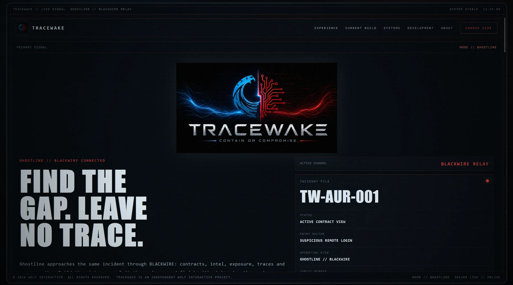
Before the visitor sees a navigation bar or a feature list, the site behaves like a system waking up. It searches for residual activity, detects Aurelius, finds the Ghostline counter-signal and warns that the incident perspective is unresolved.
It is a small thing, and there is a skip button because nobody needs to be imprisoned by a website intro every time they visit, but it changes the first few seconds completely.
You are not just opening a product page.
You are connecting to something.
That also led to the desktop version living inside an LCD-style shell inspired by TRACEWAKE’s own framing. The content scrolls inside it rather than the frame floating over the page. On mobile and tablet the heavy bezel drops away, because squeezing a fake monitor around a phone screen would mostly succeed at making the phone worse.
Choose a side, but only when you want to
We went back and forth on whether the site should force a side choice.
For a while the flow was boot sequence, then immediately pick Aurelius or Ghostline. It was dramatic, but it also meant somebody who just wanted to learn what TRACEWAKE was had to make a decision before they had any context.
The final version opens in a neutral TRACEWAKE view. Choose Side stays prominent, but it is an invitation rather than a gate.
When the visitor does open it, the selector deliberately borrows from the in-game presentation rather than dropping a pair of normal website cards into a modal.
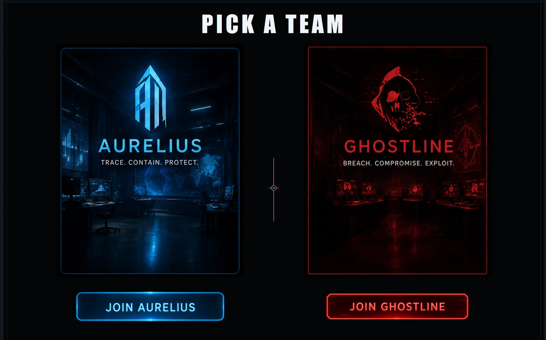
The language has changed too.
Red Team and Blue Team still make sense as development shorthand, but they are no longer the public identity of the two experiences. Players enter Aurelius. They operate through Ghostline and BLACKWIRE.
That is a much more useful distinction now that both sides have their own culture, interface and campaign role.
Showing the game that actually exists
There was another rule I wanted to keep: the website should not quietly pretend that old concept art is a current screenshot.
We still have earlier Aurelius and BLACKWIRE visual prototypes that I really like. They helped define where those systems were heading. They are still useful, and they are still on the site, but they are labelled as concept direction.
The current-build section uses the actual game.
That means the Aurelius operations hub, BLACKWIRE, the active workstation and Ghostline running an operation. It also means showing some of the smaller gameplay systems, such as reconstructing an incident timeline from evidence rather than only showing the broad dashboards.
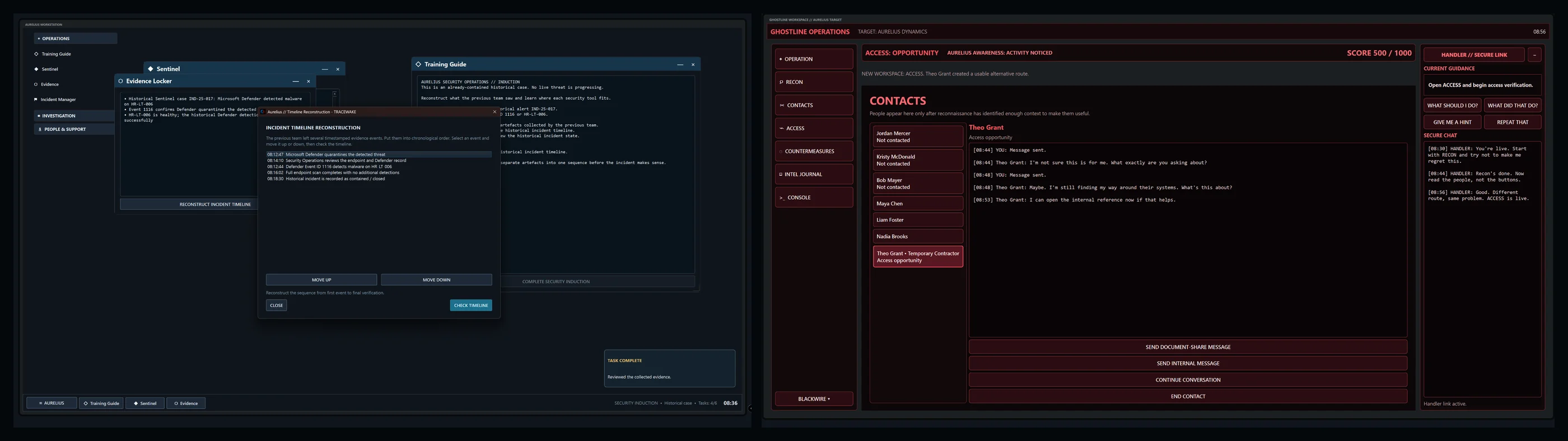
That matters to me because TRACEWAKE has spent enough time as an experiment that it is easy to keep talking about what it will be.
There is enough game there now to show what it is.
Then the phone got a vote
The desktop version could afford to be theatrical. The phone could not.
The first mobile layout technically worked, but six navigation links were using far too much of the header. Choose Side was the important action, so that stayed visible while the rest collapsed into a menu.
The desktop bezel also disappears at smaller screen sizes. The scanlines, dark interface and overall TRACEWAKE language remain, but the ornamental frame gets out of the way.
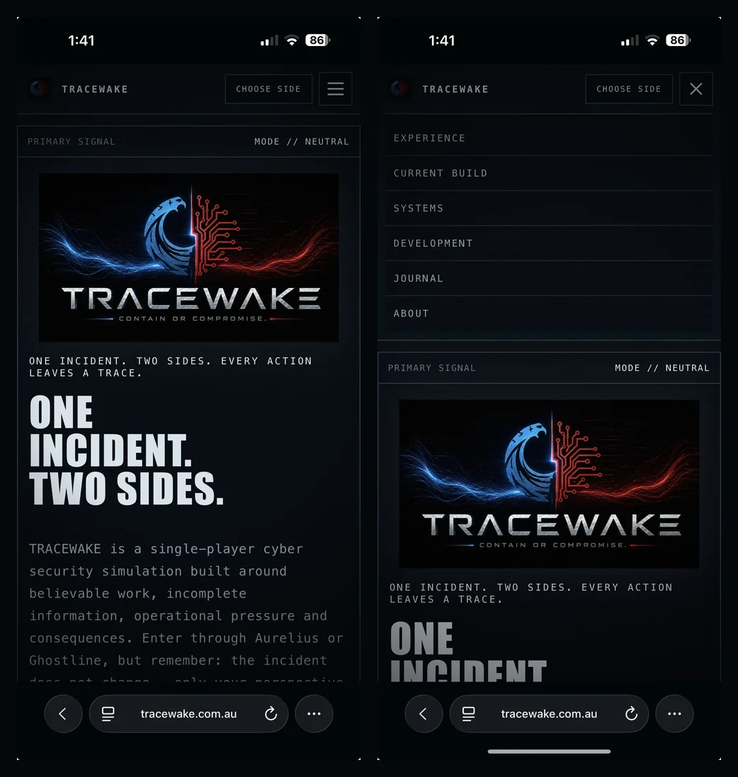
That was one of those changes where the moment it was on an actual phone, the answer was obvious.
It also confirmed something useful about the site as a whole: matching the game does not mean copying every desktop behaviour onto every screen. It means keeping the same identity while letting the interface behave properly for the device it is actually running on.
The unexciting things that make it a real website
Once the layout stopped arguing with me, the work became less glamorous and more important.
The release candidate picked up the things nobody puts in a teaser trailer:
- a proper favicon and social preview;
- Open Graph and search metadata;
- a sitemap and robots file;
- a custom 404 page;
- keyboard focus states and reduced-motion handling;
- responsive image optimisation;
- legal and privacy information;
- and a direct link back to the TRACEWAKE development journal here on Wolf Interactive.
The production package also went on a diet. The development folder had accumulated full-size images and duplicate assets, so the live version was compressed and cleaned up before deployment.
None of that changes the headline screenshot.
All of it changes whether the site feels finished.
TRACEWAKE is live
The dedicated site is now live at:
That still feels slightly strange to write.
The project is very much still in alpha. Aurelius is evolving. Ghostline is evolving. The campaign layer, operations and persistent consequences are still growing. There are systems I want to revisit and a substantial list of things that do not exist yet.
But TRACEWAKE now has its own front door.
Not a placeholder page buried inside the studio site. Not a generic game landing page with a few screenshots and a neon grid behind it.
Something that belongs to the same world as the thing it is presenting.
For now, I am going to do something surprisingly difficult and leave it alone for a bit.
Let it marinate.
ONE INCIDENT. TWO SIDES. EVERY ACTION LEAVES A TRACE.
Anthony
Wolf Interactive
Make. Explore. Evolve.